CSS Grid - Grid Template Areas
Exercise
- In the "index.html" file, replace the code with the following:
<!DOCTYPE html>
<html lang="en">

<head>
  <meta charset="UTF-8">
  <meta http-equiv="X-UA-Compatible" content="IE=edge">
  <meta name="viewport" content="width=device-width, initial-scale=1.0">
  <title>CSS</title>
  <link rel="stylesheet" href="./css/styles.css">
</head>

<body>
  <h1>CSS Grid</h1>
  <h3>Grid Template Areas</h3>
  <!-- grid container -->
  <div class="grid-container-3-columns-by-3-rows">
    <!-- flex items -->
    <div class="box area1">
      <p>Grid Item 1</p>
    </div>
    <div class="box area2">
      <p>Grid Item 2</p>
    </div>
    <div class="box area3">
      <p>Grid Item 3</p>
    </div>
    <div class="box area4">
      <p>Grid Item 4</p>
    </div>
    <div class="box area5">
      <p>Grid Item 5</p>
    </div>
    <div class="box area6">
      <p>Grid Item 6</p>
    </div>
  </div>
</body>

</html>
- Save.
- If "Live Server" is not already running, right-click anywhere in the editor and select "Open with Live Server" from the context menu.
- In the "styles.css" file, replace the code with the following:
/* Reset Browser Defaults */
* {
  margin: 0;
  padding: 0;
  box-sizing: border-box;
}

.grid-container-3-columns-by-3-rows {
  border: 5px solid blue;
  margin: 10px;
  display: grid;
  grid-template-columns: 1fr 1fr 1fr;
  grid-template-rows: 100px 100px 100px 100px 100px;
  grid-template-areas:
    "area1 area1 area2"
    "area1 area1 area2"
    "area1 area1 area3"
    "area4 area5 area5"
    "area6 area6 area6";
}

.box {
  border: 2px solid red;
}

.area1 {
  background: green;
  grid-area: area1;
}

.area2 {
  background: yellow;
  grid-area: area2;
}

.area3 {
  background: orange;
  grid-area: area3;
}

.area4 {
  background: brown;
  grid-area: area4;
}

.area5 {
  background: grey;
  grid-area: area5;
}

.area6 {
  background: violet;
  grid-area: area6;
}
- Save.
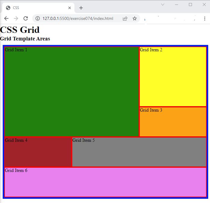
- In the browser, you should see the following:

Code Walkthrough and Explanation
grid-template-areas
grid-template-areas is a CSS property used in CSS Grid layouts to define named grid areas within
the
grid container. It allows for a more intuitive way of defining the layout by assigning names to specific grid
cells,
making it easier to organize and manipulate the layout.
The property takes a string value consisting of one or more names, with each name representing a grid area. The names are separated by whitespace and arranged in a pattern that corresponds to the grid container's rows and columns.
For example, consider a 3x3 grid where the top row has two columns and the bottom row has one column. We could define the grid areas as follows:
grid-template-areas:
  "header header"
  "sidebar main"
  "footer footer";
This defines four named areas: header, sidebar, main, and
footer.
The first row has two columns, both of which are named header. The second row has a
sidebar
area in the first column and a main area in the second column. The third row has a single
footer area.
Once the grid areas have been defined, they can be assigned to elements using the grid-area
property,
allowing for easy positioning and layout.
Experiment with the Code
- Try different names for the grid template areas and then apply those area names to the boxes.
- Try adding more boxes and expanding the area of the boxes in the grid template area.
Video and Code References
Questions? Subscribe and ask in the video comments: