CSS Grid - Grid Lines
Exercise
- In the "index.html" file, replace the code with the following:
<!DOCTYPE html>
<html lang="en">

<head>
  <meta charset="UTF-8">
  <meta http-equiv="X-UA-Compatible" content="IE=edge">
  <meta name="viewport" content="width=device-width, initial-scale=1.0">
  <title>CSS</title>
  <link rel="stylesheet" href="./css/styles.css">
</head>

<body>
  <h1>CSS Grid</h1>
  <h3>Grid Lines</h3>
  <!-- grid container -->
  <div class="grid-container-3-columns-by-3-rows">
    <!-- flex items -->
    <div class="box long-hand-grid-lines">
      <p>Grid Item 1</p>
    </div>
    <div class="box">
      <p>Grid Item 2</p>
    </div>
    <div class="box">
      <p>Grid Item 3</p>
    </div>
    <div class="box">
      <p>Grid Item 4</p>
    </div>
    <div class="box">
      <p>Grid Item 5</p>
    </div>
    <div class="box">
      <p>Grid Item 6</p>
    </div>
  </div>
  <!-- grid container -->
  <div class="grid-container-3-columns-by-3-rows">
    <!-- flex items -->
    <div class="box short-hand-grid-lines">
      <p>Grid Item 1</p>
    </div>
    <div class="box">
      <p>Grid Item 2</p>
    </div>
    <div class="box">
      <p>Grid Item 3</p>
    </div>
    <div class="box">
      <p>Grid Item 4</p>
    </div>
    <div class="box">
      <p>Grid Item 5</p>
    </div>
    <div class="box">
      <p>Grid Item 6</p>
    </div>
  </div>
</body>

</html>
- Save.
- If "Live Server" is not already running, right-click anywhere in the editor and select "Open with Live Server" from the context menu.
- In the "styles.css" file, replace the code with the following:
/* Reset Browser Defaults */
* {
  margin: 0;
  padding: 0;
  box-sizing: border-box;
}

.grid-container-3-columns-by-3-rows {
  border: 5px solid blue;
  margin: 10px;
  display: grid;
  grid-template-columns: 1fr 2fr 1fr;
  grid-template-rows: 1fr 2fr 1fr;
  gap: 10px;
}

.box {
  padding: 1rem;
  background: grey;
  border: 2px solid red;
}

.long-hand-grid-lines {
  grid-column-start: 1;
  grid-column-end: 3;
  grid-row-start: 1;
  grid-row-end: 3;
}

.short-hand-grid-lines {
  grid-column: 1/3;
  grid-row: 1/3;
}
- Save.
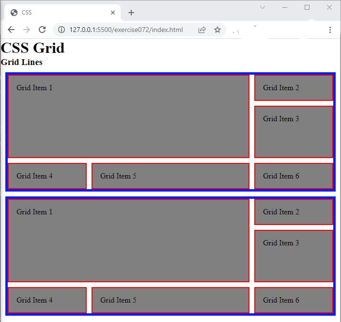
- In the browser, you should see the following:

Code Walkthrough and Explanation
Grid Lines
In CSS Grid, grid lines refer to the lines that define the grid columns and rows. The lines are created by the
intersection of rows and columns, forming a grid of cells. The lines are numbered starting from 1 and increase
as they
move from the top left corner of the grid. The number of lines is determined by the number of columns and rows
specified in the grid-template-columns and grid-template-rows properties. The grid
lines can
be used to position grid items using the grid-row and grid-column properties, which
specify
the start and end lines of a grid item within the grid.
grid-column-start
grid-column-start is a property in CSS Grid that defines where a grid item should start its
placement
within a grid container along the horizontal axis. It specifies the grid line where the item should start.
grid-column-end
In CSS Grid, the grid-column-end property is used to specify the end position of an item within
the
grid. It defines the ending grid line of the item's span along the horizontal axis. The value can be a line
number or a span keyword to define the size of the grid item. It works together with the
grid-column-start property to define the grid item's placement and size within the grid
container.
If the grid-column-start and grid-column-end values are the same, the item will span
only
one column. If they are different, the item will span multiple columns.
grid-row-start
In CSS Grid, grid-row-start is a property used to specify the start position of an element within
a grid
container on the vertical axis (rows). It defines the grid line where the element's first row should start.
grid-row-end
In CSS Grid, the grid-row-end property specifies the ending position of an item within a grid
container
along the vertical (y) axis. It defines the grid lines on which an item will end. The grid-row-end
property is used together with grid-row-start property to define the grid tracks an item will span
in the
grid container. The value can be an integer representing a grid line number or a name that refers to a named
grid
line.
grid-row
In CSS Grid, the grid-row property is a shorthand for defining both grid-row-start
and
grid-row-end at the same time. It is used to specify the grid items' placement along the
vertical
axis of the grid.
The grid-row property takes two values separated by a /. The first value represents
the
grid-row-start and the second value after the / represents the
grid-row-end.
grid-column
In CSS Grid, grid-column is a shorthand property that allows you to specify the starting and
ending grid
lines for a grid item on the horizontal (X) axis. It is used to set the location of the item within the grid
container
along the X axis.
The grid-column property takes two values separated by a /. The first value
represents the
grid-column-start and the second value after the / represents the
grid-column-end.
Experiment with the Code
- Try changing the values of
grid-column-startandgrid-column-endand see what happens. - Try changing the values of
grid-row-startandgrid-row-endand see what happens. - Try changing the values of
grid-rowand see what happens. - Try changing the values of
grid-columnand see what happens.
Video and Code References
Questions? Subscribe and ask in the video comments: