CSS Grid - Grid Gap
Exercise
- In the "index.html" file, replace the code with the following:
<!DOCTYPE html>
<html lang="en">

<head>
  <meta charset="UTF-8">
  <meta http-equiv="X-UA-Compatible" content="IE=edge">
  <meta name="viewport" content="width=device-width, initial-scale=1.0">
  <title>CSS</title>
  <link rel="stylesheet" href="./css/styles.css">
</head>

<body>
  <h1>CSS Grid</h1>
  <h3>Grid Gap</h3>
  <!-- grid container -->
  <div class="grid-container-2-rows row-gap">
    <!-- flex items -->
    <div class="box">
      <p>Grid Item 1</p>
    </div>
    <div class="box">
      <p>Grid Item 2</p>
    </div>
  </div>
  <!-- grid container -->
  <div class="grid-container-3-columns column-gap">
    <!-- flex items -->
    <div class="box">
      <p>Grid Item 1</p>
    </div>
    <div class="box">
      <p>Grid Item 2</p>
    </div>
    <div class="box">
      <p>Grid Item 3</p>
    </div>
  </div>
  <!-- grid container -->
  <div class="grid-container-3-columns-by-2-rows gap">
    <!-- flex items -->
    <div class="box">
      <p>Grid Item 1</p>
    </div>
    <div class="box">
      <p>Grid Item 2</p>
    </div>
    <div class="box">
      <p>Grid Item 3</p>
    </div>
    <div class="box">
      <p>Grid Item 4</p>
    </div>
    <div class="box">
      <p>Grid Item 5</p>
    </div>
    <div class="box">
      <p>Grid Item 6</p>
    </div>
  </div>
</body>

</html>
- Save.
- If "Live Server" is not already running, right-click anywhere in the editor and select "Open with Live Server" from the context menu.
- In the "styles.css" file, replace the code with the following:
/* Reset Browser Defaults */
* {
  margin: 0;
  padding: 0;
  box-sizing: border-box;
}

.grid-container-2-rows {
  border: 5px solid blue;
  margin: 10px;
  display: grid;
  grid-template-rows: 100px 200px;
}

.grid-container-3-columns {
  border: 5px solid blue;
  margin: 10px;
  display: grid;
  grid-template-columns: 1fr 2fr 1fr;
}

.grid-container-3-columns-by-2-rows {
  border: 5px solid blue;
  margin: 10px;
  display: grid;
  grid-template-columns: 1fr 2fr 1fr;
  grid-template-rows: 1fr 2fr;
}

.box {
  padding: 1rem;
  background: grey;
  border: 2px solid red;
}

.row-gap {
  row-gap: 10px;
}

.column-gap {
  column-gap: 20px;
}

.gap {
  gap: 10px 20px;
}
- Save.
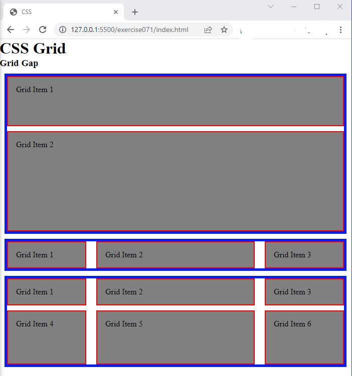
- In the browser, you should see the following:

Code Walkthrough and Explanation
row-gap
row-gap is a CSS property that specifies the size of the gap between rows in a CSS grid layout. It
sets
the size of the gap (also called gutter) between grid rows, which is the space between two adjacent rows of grid
items. The property takes a length value, such as px, em, or rem, or a
percentage value, such as %, to specify the size of the gap. By using the row-gap
property,
you can control the spacing between rows and create a well-organized, visually appealing grid layout.
column-gap
The column-gap property in CSS is used to set the size of the gap between columns in a grid. It
defines
the horizontal spacing between the grid columns. The value of the property can be set in any length unit such as
pixels, ems, rems, or percentages. If you set the value to zero, there will be no gap
between the columns, and if you set a positive value, the gap will increase accordingly. Together with the
row-gap property, these two properties allow you to control the overall spacing between the grid
items.
gap
In CSS Grid, gap is a shorthand property that sets the gap (or gutter) between rows and columns in
a
grid layout. It is a convenient way to set both row-gap and column-gap properties at
once.
The gap property accepts one or two values. If one value is provided, it sets the gap size for
both rows
and columns. If two values are provided, the first sets the gap size for rows and the second for columns.
The gap size can be specified in any CSS length unit, such as pixels (px), ems, rems, or percentages (%). It is important to note that the gap is an empty space and doesn't count as a row or column in the grid.
Experiment with the Code
- Try changing the value of
column-gapand see what happens. - Try changing the value of
row-gapand see what happens. - Try changing the value of
gapand see what happens.
Video and Code References
Questions? Subscribe and ask in the video comments: