CSS Grid - Align Items and Self
Exercise
- In the "index.html" file, replace the code with the following:
<!DOCTYPE html>
<html lang="en">

<head>
  <meta charset="UTF-8">
  <meta http-equiv="X-UA-Compatible" content="IE=edge">
  <meta name="viewport" content="width=device-width, initial-scale=1.0">
  <title>CSS</title>
  <link rel="stylesheet" href="./css/styles.css">
</head>

<body>
  <h1>CSS Grid</h1>
  <h3>Align Items and Self</h3>
  <!-- grid container -->
  <div class="grid-container-3-columns-by-3-rows">
    <!-- flex items -->
    <div class="box box1">
      <p>Grid Item 1</p>
    </div>
    <div class="box box2">
      <p>Grid Item 2</p>
    </div>
    <div class="box box3">
      <p>Grid Item 3</p>
    </div>
    <div class="box box4">
      <p>Grid Item 4</p>
    </div>
    <div class="box box5">
      <p>Grid Item 5</p>
    </div>
    <div class="box box6">
      <p>Grid Item 6</p>
    </div>
  </div>
  <!-- grid container -->
  <div class="grid-container-3-columns-by-3-rows align-items">
    <!-- flex items -->
    <div class="box box1">
      <p>Grid Item 1</p>
    </div>
    <div class="box box2">
      <p>Grid Item 2</p>
    </div>
    <div class="box box3 align-self">
      <p>Grid Item 3</p>
    </div>
    <div class="box box4">
      <p>Grid Item 4</p>
    </div>
    <div class="box box5">
      <p>Grid Item 5</p>
    </div>
    <div class="box box6">
      <p>Grid Item 6</p>
    </div>
  </div>
</body>

</html>
- Save.
- If "Live Server" is not already running, right-click anywhere in the editor and select "Open with Live Server" from the context menu.
- In the "styles.css" file, replace the code with the following:
/* Reset Browser Defaults */
* {
  margin: 0;
  padding: 0;
  box-sizing: border-box;
}

.grid-container-3-columns-by-3-rows {
  border: 5px solid blue;
  margin: 10px;
  display: grid;
  grid-template-columns: repeat(3, 1fr);
  grid-template-rows: repeat(2, 1fr);
  height: 300px;
}

.align-items {
  align-items: center;
}

.align-self {
  align-self: start;
}

.box {
  padding: 1rem;
  border: 2px solid red;
}

.box1 {
  background: green;
}

.box2 {
  background: yellow;
}

.box3 {
  background: orange;
}

.box4 {
  background: brown;
}

.box5 {
  background: grey;
}

.box6 {
  background: violet;
}
- Save.
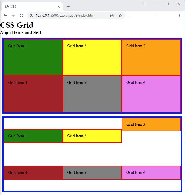
- In the browser, you should see the following:

Code Walkthrough and Explanation
align-items
align-items is a CSS property used in CSS Grid to align grid items vertically within a grid
container.
It is used to align the grid items along the grid container's cross-axis. The cross-axis runs perpendicular
to
the main axis, which is determined by the grid-template-rows or grid-template-columns
properties.
Possible values for align-items include:
stretch: The default value. The grid items are stretched to fill the entire grid cell vertically.start: The grid items are aligned with the start of the grid cell along the cross-axis.end: The grid items are aligned with the end of the grid cell along the cross-axis.center: The grid items are centered vertically within the grid cell along the cross-axis.baseline: The grid items are aligned such that their baselines are aligned with each other within the grid cell along the cross-axis.
align-self
In CSS Grid, the align-self property is used to align grid items along the vertical axis within
their
grid cell. It allows you to override the alignment set by the align-items property for a specific grid item.
The align-self property can be used on individual grid items and accepts the same values as
align-items, including:
start: aligns the item to the start of the grid cellend: aligns the item to the end of the grid cellcenter: aligns the item to the center of the grid cellstretch: stretches the item to fill the entire height of the grid cellbaseline: aligns the item to the baseline of the grid cell
By default, all grid items are aligned to the stretch value for the align-self property, which
means
they will fill the entire height of their grid cell. You can use the align-self property to change
this
alignment for individual items.
Experiment with the Code
- Try changing the value in the
align-itemsproperty and see what happens. - Try changing the value in the
align-selfproperty and see what happens.
Video and Code References
Questions? Subscribe and ask in the video comments: