CSS Flexbox - Flex Shrink
Exercise
- In the "index.html" file, replace the code with the following:
<!DOCTYPE html>
<html lang="en">

<head>
  <meta charset="UTF-8">
  <meta http-equiv="X-UA-Compatible" content="IE=edge">
  <meta name="viewport" content="width=device-width, initial-scale=1.0">
  <title>CSS</title>
  <link rel="stylesheet" href="./css/styles.css">
</head>

<body>
  <h1>CSS Flexbox</h1>
  <h3>Flex Shrink</h3>
  <!-- flex container -->
  <div class="flex-container">
    <!-- flex items -->
    <div class="box flex-item-1">
      <p>Flex Item 1</p>
    </div>
    <div class="box flex-item-2">
      <p>Flex Item 2</p>
    </div>
    <div class="box flex-item-3 flex-shrink">
      <p>Flex Item 3</p>
    </div>
    <div class="box flex-item-4">
      <p>Flex Item 4</p>
    </div>
    <div class="box flex-item-5">
      <p>Flex Item 5</p>
    </div>
    <div class="box flex-item-6">
      <p>Flex Item 6</p>
    </div>
  </div>
  <!-- flex container -->
  <div class="flex-container">
    <!-- flex items -->
    <div class="box flex-item-1">
      <p>Flex Item 1</p>
    </div>
    <div class="box flex-item-2">
      <p>Flex Item 2</p>
    </div>
    <div class="box flex-item-3">
      <p>Flex Item 3</p>
    </div>
    <div class="box flex-item-4">
      <p>Flex Item 4</p>
    </div>
    <div class="box flex-item-5">
      <p>Flex Item 5</p>
    </div>
    <div class="box flex-item-6">
      <p>Flex Item 6</p>
    </div>
  </div>
</body>

</html>
- Save.
- If "Live Server" is not already running, right-click anywhere in the editor and select "Open with Live Server" from the context menu.
- In the "styles.css" file, replace the code with the following:
.flex-container {
  border: 5px solid blue;
  display: flex;
  margin: 10px;
  height: 300px;
}

.box {
  padding: 10px;
  text-align: center;
  font-size: 20px;
}

.flex-shrink {
  flex-shrink: 0;
}

.flex-item-1 {
  background: red;
}

.flex-item-2 {
  background: green;
}

.flex-item-3 {
  background: yellow;
  width: 300px;
}

.flex-item-4 {
  background: purple;
}

.flex-item-5 {
  background: orange;
}

.flex-item-6 {
  background: blueviolet;
}
- Save.
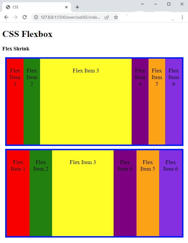
- In the browser, you should see the following:
- Resize the browser window and observe what happens with "Flex Item 3"

Code Walkthrough and Explanation
flex-shrink
In CSS, the flex-shrink property is used in conjunction with the flex-grow property
to
determine how flex items are resized when there is not enough space available in the flex container.
The flex-shrink` property controls the ability of a flex item to shrink when the available space
in the
flex container is less than the total size of all the flex items. It is a unitless value that represents the
proportion of the available space that the flex item should take up when there is not enough space.
A value of 0 means that the flex item will not shrink, while a value greater than 0 means that the flex item
will
shrink proportionally to its flex-shrink value. The default value of flex-shrink is 1, which means
that
all flex items will shrink proportionally by default. A value of flex-shrink: 0 will prevent a flex
item
from shrinking.
Experiment with the Code
- Try adding your own boxes and using different values for
flex-shrink.
Video and Code References
Questions? Subscribe and ask in the video comments: