CSS Flexbox - Flex Grow
Exercise
- In the "index.html" file, replace the code with the following:
<!DOCTYPE html>
<html lang="en">

<head>
  <meta charset="UTF-8">
  <meta http-equiv="X-UA-Compatible" content="IE=edge">
  <meta name="viewport" content="width=device-width, initial-scale=1.0">
  <title>CSS</title>
  <link rel="stylesheet" href="./css/styles.css">
</head>

<body>
  <h1>CSS Flexbox</h1>
  <h3>Flex Grow</h3>
  <!-- flex container -->
  <div class="flex-container">
    <!-- flex items -->
    <div class="box flex-item-1">
      <p>Flex Item 1</p>
    </div>
    <div class="box flex-item-2">
      <p>Flex Item 2</p>
    </div>
    <div class="box flex-item-3">
      <p>Flex Item 3</p>
    </div>
    <div class="box flex-item-4">
      <p>Flex Item 4</p>
    </div>
    <div class="box flex-item-5">
      <p>Flex Item 5</p>
    </div>
  </div>
  <!-- flex container -->
  <div class="flex-container">
    <!-- flex items -->
    <div class="box flex-item-1">
      <p>Flex Item 1</p>
    </div>
    <div class="box flex-item-2">
      <p>Flex Item 2</p>
    </div>
    <div class="box flex-item-3">
      <p>Flex Item 3</p>
    </div>
  </div>
</body>

</html>
- Save.
- If "Live Server" is not already running, right-click anywhere in the editor and select "Open with Live Server" from the context menu.
- In the "styles.css" file, replace the code with the following:
.flex-container {
  border: 5px solid blue;
  display: flex;
  margin: 10px;
  height: 200px;
}

.box {
  padding: 10px;
  width: 100px;
  height: 100px;
  text-align: center;
  font-size: 20px;
}

.flex-item-1 {
  background: red;
  flex-grow: 2;
}

.flex-item-2 {
  background: green;
  flex-grow: 3;
}

.flex-item-3 {
  background: yellow;
}

.flex-item-4 {
  background: purple;
}

.flex-item-5 {
  background: orange;
}
- Save.
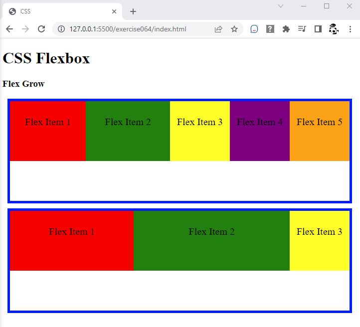
- In the browser, you should see the following:
- Resize the browser window and observe what happens with "Flex Item 2"

Code Walkthrough and Explanation
flex-grow
flex-grow is a CSS property that is used to specify the extent to which a flex item should grow
relative
to other flex items in the flex container. The value of flex-grow determines the amount of
available
space inside the flex container that a flex item should occupy. By default, the value of flex-grow
is set
to 0, which means that the flex item will not grow, and will remain at its initial size. A higher value of
flex-grow means that the flex item will grow more than the other flex items in the container. For
example, if one flex item has flex-grow: 2 and another has flex-grow: 1, the first
flex item
will occupy twice as much space as the second item.
Experiment with the Code
- Try adding your own boxes and using different values for
flex-grow.
Video and Code References
Questions? Subscribe and ask in the video comments: