CSS Flexbox - Flex (Shorthand)
Exercise
- In the "index.html" file, replace the code with the following:
<!DOCTYPE html>
<html lang="en">

<head>
  <meta charset="UTF-8">
  <meta http-equiv="X-UA-Compatible" content="IE=edge">
  <meta name="viewport" content="width=device-width, initial-scale=1.0">
  <title>CSS</title>
  <link rel="stylesheet" href="./css/styles.css">
</head>

<body>
  <h1>CSS Flexbox</h1>
  <h3>Flex (Shorthand)</h3>
  <!-- flex container -->
  <div class="flex-container">
    <!-- flex items -->
    <div class="box flex-item-1">
      <p>Flex Item 1</p>
    </div>
    <div class="box flex-item-2">
      <p>Flex Item 2</p>
    </div>
    <div class="box flex-item-3 flex">
      <p>Flex Item 3</p>
    </div>
    <div class="box flex-item-4">
      <p>Flex Item 4</p>
    </div>
    <div class="box flex-item-5">
      <p>Flex Item 5</p>
    </div>
    <div class="box flex-item-6">
      <p>Flex Item 6</p>
    </div>
  </div>
  <!-- flex container -->
  <div class="flex-container">
    <!-- flex items -->
    <div class="box flex-item-1">
      <p>Flex Item 1</p>
    </div>
    <div class="box flex-item-2">
      <p>Flex Item 2</p>
    </div>
    <div class="box flex-item-3">
      <p>Flex Item 3</p>
    </div>
    <div class="box flex-item-4">
      <p>Flex Item 4</p>
    </div>
    <div class="box flex-item-5">
      <p>Flex Item 5</p>
    </div>
    <div class="box flex-item-6">
      <p>Flex Item 6</p>
    </div>
  </div>
</body>

</html>
- Save.
- If "Live Server" is not already running, right-click anywhere in the editor and select "Open with Live Server" from the context menu.
- In the "styles.css" file, replace the code with the following:
.flex-container {
  border: 5px solid blue;
  display: flex;
  margin: 10px;
  height: 300px;
}

.box {
  padding: 10px;
  text-align: center;
  font-size: 20px;
}

.flex {
  flex: 0 0 300px;
}

.flex-item-1 {
  background: red;
}

.flex-item-2 {
  background: green;
}

.flex-item-3 {
  background: yellow;
}

.flex-item-4 {
  background: purple;
}

.flex-item-5 {
  background: orange;
}

.flex-item-6 {
  background: blueviolet;
}
- Save.
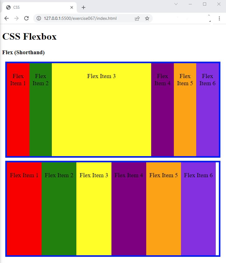
- In the browser, you should see the following:
- Resize the browser window and observe what happens.

Code Walkthrough and Explanation
flex
In CSS, flex is a shorthand property for the flex-grow, flex-shrink, and
flex-basis properties that specify how a flex item will grow, shrink, and be sized in relation to
other
flex items in the same container. The flex property is typically used on flex items within a flex
container, and is used to control the item's ability to expand or shrink to fill the available space along
the
main axis of the container.
The flex property takes up to three values:
flex-grow: specifies how much the item will grow relative to the other items in the container. It is a unitless value that indicates the proportion of available space the item should take up.flex-shrink: specifies how much the item will shrink relative to the other items in the container. It is a unitless value that indicates the proportion of available space the item should give up.flex-basis: specifies the initial size of the item before any available space is distributed among the items. It can be a length value like px or %, or the auto keyword, which sets the initial size based on the item's content.
Experiment with the Code
- Try changing the values of
flexand see what happens.
Video and Code References
Questions? Subscribe and ask in the video comments: