CSS Flexbox - Gap
Exercise
- In the "index.html" file, replace the code with the following:
<!DOCTYPE html>
<html lang="en">

<head>
  <meta charset="UTF-8">
  <meta http-equiv="X-UA-Compatible" content="IE=edge">
  <meta name="viewport" content="width=device-width, initial-scale=1.0">
  <title>CSS</title>
  <link rel="stylesheet" href="./css/styles.css">
</head>

<body>
  <h1>CSS Flexbox</h1>
  <h3>Gap</h3>
  <!-- flex container -->
  <div class="flex-container">
    <!-- flex items -->
    <div class="box flex-item-1">
      <p>Flex Item 1</p>
    </div>
    <div class="box flex-item-2">
      <p>Flex Item 2</p>
    </div>
    <div class="box flex-item-3 flex">
      <p>Flex Item 3</p>
    </div>
  </div>
  <!-- flex container -->
  <div class="flex-container gap">
    <!-- flex items -->
    <div class="box flex-item-1">
      <p>Flex Item 1</p>
    </div>
    <div class="box flex-item-2">
      <p>Flex Item 2</p>
    </div>
    <div class="box flex-item-3">
      <p>Flex Item 3</p>
    </div>
  </div>
</body>

</html>
- Save.
- If "Live Server" is not already running, right-click anywhere in the editor and select "Open with Live Server" from the context menu.
- In the "styles.css" file, replace the code with the following:
.flex-container {
  border: 5px solid blue;
  display: flex;
  margin: 10px;
  height: 300px;
  align-items: center;
}

.gap {
  gap: 30px;
}

.box {
  padding: 10px;
  text-align: center;
  font-size: 20px;
}

.flex-item-1 {
  background: red;
}

.flex-item-2 {
  background: green;
}

.flex-item-3 {
  background: yellow;
}
- Save.
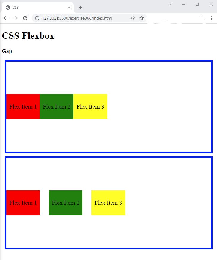
- In the browser, you should see the following:

Code Walkthrough and Explanation
gap
The gap property in CSS is used to specify the space between the items in a CSS flexbox container.
It
sets the size of the gap between the rows and/or columns of a flex container. The gap property can
be set
on the parent container using the gap shorthand property or the row-gap and
column-gap properties. The gap property is a shorthand for setting both
row-gap
and column-gap at once. It can take a single value to set the same gap size for both row and
column, or
two values to set different gap sizes for rows and columns. The gap property is used to provide
more
control over the spacing between the flex items, making it a useful property for responsive design.
Experiment with the Code
- Try changing the values of
gapand see what happens.
Video and Code References
Questions? Subscribe and ask in the video comments: