CSS Flexbox - Flex Direction
Exercise
- In the "index.html" file, replace the code with the following:
<!DOCTYPE html>
<html lang="en">

<head>
  <meta charset="UTF-8">
  <meta http-equiv="X-UA-Compatible" content="IE=edge">
  <meta name="viewport" content="width=device-width, initial-scale=1.0">
  <title>CSS</title>
  <link rel="stylesheet" href="./css/styles.css">
</head>

<body>
  <h1>CSS Flexbox</h1>
  <h3>Flex Direction</h3>
  <!-- flex container -->
  <div id="flex-container-row">
    <!-- flex items -->
    <div class="box flex-item-1">
      <p>Flex Item 1</p>
    </div>
    <div class="box flex-item-2">
      <p>Flex Item 2</p>
    </div>
    <div class="box flex-item-3">
      <p>Flex Item 3</p>
    </div>
    <div class="box flex-item-4">
      <p>Flex Item 4</p>
    </div>
    <div class="box flex-item-5">
      <p>Flex Item 5</p>
    </div>
  </div>
  <!-- flex container -->
  <div id="flex-container-row-reverse">
    <!-- flex items -->
    <div class="box flex-item-1">
      <p>Flex Item 1</p>
    </div>
    <div class="box flex-item-2">
      <p>Flex Item 2</p>
    </div>
    <div class="box flex-item-3">
      <p>Flex Item 3</p>
    </div>
    <div class="box flex-item-4">
      <p>Flex Item 4</p>
    </div>
    <div class="box flex-item-5">
      <p>Flex Item 5</p>
    </div>
  </div>
  <!-- flex container -->
  <div id="flex-container-column">
    <!-- flex items -->
    <div class="box flex-item-1">
      <p>Flex Item 1</p>
    </div>
    <div class="box flex-item-2">
      <p>Flex Item 2</p>
    </div>
    <div class="box flex-item-3">
      <p>Flex Item 3</p>
    </div>
    <div class="box flex-item-4">
      <p>Flex Item 4</p>
    </div>
    <div class="box flex-item-5">
      <p>Flex Item 5</p>
    </div>
  </div>
  <!-- flex container -->
  <div id="flex-container-column-reverse">
    <!-- flex items -->
    <div class="box flex-item-1">
      <p>Flex Item 1</p>
    </div>
    <div class="box flex-item-2">
      <p>Flex Item 2</p>
    </div>
    <div class="box flex-item-3">
      <p>Flex Item 3</p>
    </div>
    <div class="box flex-item-4">
      <p>Flex Item 4</p>
    </div>
    <div class="box flex-item-5">
      <p>Flex Item 5</p>
    </div>
  </div>
</body>

</html>
- Save.
- If "Live Server" is not already running, right-click anywhere in the editor and select "Open with Live Server" from the context menu.
- In the "styles.css" file, replace the code with the following:
#flex-container-row {
  border: 5px solid blue;
  display: flex;
  margin: 10px;
  flex-direction: row;
}

#flex-container-row-reverse {
  border: 5px solid blue;
  display: flex;
  margin: 10px;
  flex-direction: row-reverse;
}

#flex-container-column {
  border: 5px solid blue;
  display: flex;
  margin: 10px;
  flex-direction: column;
}

#flex-container-column-reverse {
  border: 5px solid blue;
  display: flex;
  margin: 10px;
  flex-direction: column-reverse;
}

.box {
  padding: 10px;
  text-align: center;
  font-size: 20px;
}

.flex-item-1 {
  background: red;
}

.flex-item-2 {
  background: green;
}

.flex-item-3 {
  background: yellow;
}

.flex-item-4 {
  background: purple;
}

.flex-item-5 {
  background: orange;
}
- Save.
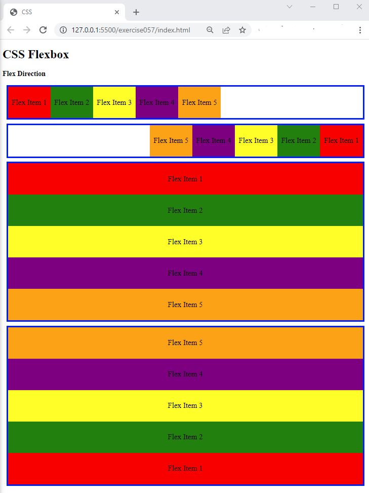
- In the browser, you should see the following:

Code Walkthrough and Explanation
CSS Flexbox
CSS Flexbox is a layout module that allows developers to create flexible and responsive layouts with ease. It provides a way to align and distribute space among elements within a container, even when their sizes are unknown or dynamic. The key idea behind Flexbox is to give the container the ability to expand and shrink its items to best fill the available space, while maintaining a consistent alignment and order. This makes it particularly useful for building complex layouts that can adapt to different screen sizes and devices. Flexbox is supported in all modern browsers and is widely used in modern web development.
flex-direction
flex-direction is a CSS property used in flexbox layouts to specify the direction of the main axis
along
which flex items are placed. It determines how flex items are laid out in a container. The four possible values
for
flex-direction are row, row-reverse, column, and
column-reverse.
row: Items are placed along the main axis in the direction of the inline axis (left-to-right or right-to-left). This is the default.row-reverse: Items are placed along the cross axis, from top to bottom.column-reverse: Items are placed along the cross axis, from bottom to top.
In CSS Flexbox, the main axis and cross axis are important concepts that determine how flex items are positioned within a flex container.
The main axis is the primary axis along which the flex items are laid out. By default, it runs horizontally from left to right (in a row) or vertically from top to bottom (in a column). The main axis is determined by the value of the flex-direction property.
The cross axis is perpendicular to the main axis and runs horizontally from top to bottom (in a row) or
vertically
from left to right (in a column). The cross axis is defined by the opposite direction of the
flex-direction property.
In other words, if flex-direction: row is set, the main axis is horizontal and runs from left to
right,
while the cross axis is vertical and runs from top to bottom. If flex-direction: column is set, the
main
axis is vertical and runs from top to bottom, while the cross axis is horizontal and runs from left to right.
Understanding the main axis and cross axis is essential for properly aligning and positioning flex items within a flex container.
Experiment with the Code
- Try adding your own boxes and using different values for
flex-direction.
Video and Code References
Questions? Subscribe and ask in the video comments: