Box Shadow
Exercise
- In the "index.html" file, replace the code with the following:
<!DOCTYPE html>
<html lang="en">

<head>
  <meta charset="UTF-8">
  <meta http-equiv="X-UA-Compatible" content="IE=edge">
  <meta name="viewport" content="width=device-width, initial-scale=1.0">
  <title>CSS</title>
  <link rel="stylesheet" href="./css/styles.css">
</head>

<body>
  <h1>Box Shadows</h1>
  <div id="container"></div>
</body>

</html>
- Save.
- If "Live Server" is not already running, right-click anywhere in the editor and select "Open with Live Server" from the context menu.
- In the "styles.css" file, replace the code with the following:
#container {
  width: 300px;
  height: 300px;
  background: green;
  margin: 30px;
  box-shadow: 10px 10px 10px red;
}
- Save.
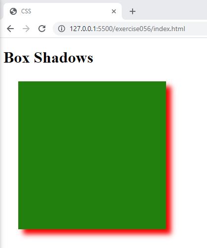
- In the browser, you should see the following:

Code Walkthrough and Explanation
box-shadow
In CSS, box-shadow is a property that allows you to add a shadow effect to an HTML element. It
creates a
shadow effect behind an element, giving it a sense of depth and making it appear more prominent on the page.
With
box-shadow, you can set the horizontal and vertical offset of the shadow from the element, as well
as its
blur radius, spread distance, and color. This property is commonly used to add visual interest to buttons,
boxes, and
other elements on a webpage. The box-shadow property can be used with any HTML element, including
divs,
buttons, and images.
Experiment with the Code
- Try changing the values of the
box-shadowproperty.
Video and Code References
Questions? Subscribe and ask in the video comments: