Text Shadow
Exercise
- In the "index.html" file, replace the code with the following:
<!DOCTYPE html>
<html lang="en">

<head>
  <meta charset="UTF-8">
  <meta http-equiv="X-UA-Compatible" content="IE=edge">
  <meta name="viewport" content="width=device-width, initial-scale=1.0">
  <title>CSS</title>
  <link rel="stylesheet" href="./css/styles.css">
</head>

<body>
  <h1>Text Shadow</h1>
  <div id="container">
    <p>This paragraph has no text shadow.</p>
    <p id="shadowy-text">This spooky text has a text shadow.</p>
  </div>
</body>

</html>
- Save.
- If "Live Server" is not already running, right-click anywhere in the editor and select "Open with Live Server" from the context menu.
- In the "styles.css" file, replace the code with the following:
#shadowy-text {
  text-shadow: 3px 2px 5px red;
  font-weight: bold;
}
- Save.
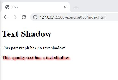
- In the browser, you should see the following:

Code Walkthrough and Explanation
text-shadow
text-shadow is a CSS property used to add a shadow effect to the text. It allows you to create a
shadow
effect behind the text by specifying the horizontal and vertical offset of the shadow, the blur radius, and the
color
of the shadow. The property can be used to add depth to your text and make it stand out on the page. The
text-shadow property takes a comma-separated list of one or more shadow values, each of which is
specified using the syntax h-shadow v-shadow blur-radius color. For
example,
text-shadow: 1px 1px 2px #000000; would create a text shadow that is 1 pixel to the right, 1 pixel
down,
with a blur radius of 2 pixels, and a color of black.
Experiment with the Code
- Try changing the values of the
text-shadowproperty.
Video and Code References
Questions? Subscribe and ask in the video comments: