Border Radius
Exercise
- In the "index.html" file, replace the code with the following:
<!DOCTYPE html>
<html lang="en">

<head>
  <meta charset="UTF-8">
  <meta http-equiv="X-UA-Compatible" content="IE=edge">
  <meta name="viewport" content="width=device-width, initial-scale=1.0">
  <title>CSS</title>
  <link rel="stylesheet" href="./css/styles.css">
</head>

<body>
  <h1>Border Radius</h1>
  <p id="normal-border">This paragraph has a normal border.</p>
  <p id="rounded-border">This paragraph has a slightly rounded border.</p>
  <p id="very-round-border">This paragraph has a very round border.</p>
</body>

</html>
- Save.
- If "Live Server" is not already running, right-click anywhere in the editor and select "Open with Live Server" from the context menu.
- In the "styles.css" file, replace the code with the following:
p {
  color: yellow;
  background-color: green;
  margin-right: 75%;
}

#normal-border {
  border: 10px solid blue;
}

#rounded-border {
  border: 10px solid blue;
  border-radius: 10px;
}

#very-round-border {
  border: 10px solid blue;
  border-radius: 50%;
}
- Save.
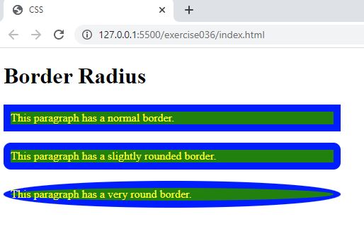
- In the browser, you should see the following:

Code Walkthrough and Explanation
border-radius
border-radius is a CSS property that allows you to create rounded corners on HTML elements. With
this
property, you can define the curvature of each corner individually or all corners at once, using either a
percentage
or a length value. The border-radius property is commonly used in web design to create visually
appealing
and modern interfaces, and it can be applied to a wide range of elements, such as buttons, images, and
containers. It
can also be used in combination with other CSS properties, such as gradients, box shadows, and background
colors, to
create unique and engaging designs.
Experiment with the Code
- Try experimenting with different values of the
border-radiusproperty.
Video and Code References
Questions? Subscribe and ask in the video comments: