Units
Exercise
- In the "index.html" file, replace the code with the following:
<!DOCTYPE html>
<html lang="en">

<head>
  <meta charset="UTF-8">
  <meta http-equiv="X-UA-Compatible" content="IE=edge">
  <meta name="viewport" content="width=device-width, initial-scale=1.0">
  <title>CSS</title>
  <link rel="stylesheet" href="./css/styles.css">
</head>

<body>
  <div id="top-box"></div>
  <div id="big-box">
    <div id="small-box"></div>
  </div>
  <p id="px-units">Paragraph <span class="em-units">1</span></p>
  <p class="em-units">Paragraph 2</p>
  <p id="rem-units">Paragraph 3</p>
</body>

</html>
- Save.
- If "Live Server" is not already running, right-click anywhere in the editor and select "Open with Live Server" from the context menu.
- In the "styles.css" file, replace the code with the following:
#big-box {
  width: 200px;
  height: 200px;
  background-color: blue;
}

#small-box {
  width: 50%;
  height: 50%;
  background-color: green;
}

#px-units {
  font-size: 32px;
}

.em-units {
  font-size: 2em;
}

#rem-units {
  font-size: 2rem;
}

#top-box {
  width: 50vw;
  height: 50vh;
  background-color: red;
}
- Save.
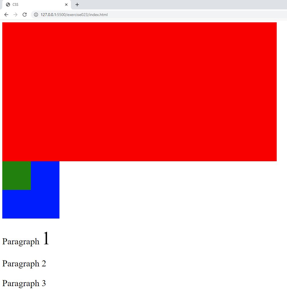
- In the browser, you should see the following:

Code Walkthrough and Explanation
In CSS, absolute and relative units are used to define the size or distance of various elements on a web page. The main difference between them is how they are defined and how they behave when the size of the viewport changes. The viewport is the user's visible area of a web page. Absolute units are fixed and do not change with the size of the viewport or parent element, while relative units are defined in relation to other elements and can adapt to different screen sizes. Each unit has its own advantages and disadvantages, and the choice of which to use will depend on the specific requirements of your design.
width: 200px;
In CSS, the width property is used to define the width of an element. It specifies the content
width of
the element, excluding any padding, border or margin.
The px stands for "pixels". It is an absolute unit of measurement and therefore does not
change with the size of the viewport. A pixel is the smallest unit of display on a screen and a pixel's
size can
vary depending on the device's resolution.
height: 50%;
In CSS, the height property is used to specify the height of an element. It defines the vertical
space
that an element occupies on a web page. By default, the height of an element is determined by the content it
contains.
The % unit is used to represent a percentage value. It is a relative unit of measurement that
represents
a portion of the available space based on a parent container or the viewport. When used with width or height
properties, the % unit sets the width or height of an element relative to its parent
container's
width or height. In the example, the <div> element with the "small-box" id is a
child of
the <div> element with the "big-box" id. The "small-box" has a relative
height
to it's parent of 50% or 100px and a relative width to it's parent of 50% or 100px.
font-size: 2em;
font-size is a CSS property that determines the size of text within an element.
em is a relative unit of measurement for specifying the size of fonts and other elements. One
em is equal to the font size of the parent element. In the exercise, the "1" contained
within a
<span> in "Paragraph 1" was set to 2em so it is twice the size of the other text in
the
paragraph. The parent of the <span> is the <p> in this case with a
font-size of
32px. It is also twice the size of the text in "Paragraph 2" even though "Paragraph 2" is
also set
to 2em. This is because the parent of Paragraph 2" is the` element which did not have an
explicit
font-size setting so it uses the default font-size of the browser which in this case is 16px.
Using em units can be useful for creating responsive designs, as the font and element sizes can be
adjusted relative to the user's chosen font size. However, it can also lead to unexpected results if not
used
carefully, as the font size of parent elements can affect the layout of child elements.
font-size: 2rem;
rem stands for "root em". It is a relative unit of measurement that represents the font
size
of the root element of the document. This means that if you set a font size using rem, it will be
relative to the font size of the root element, not the font size of the parent element. This can be useful for
creating consistent and scalable layouts across a website. Unlike em, which is relative to the font
size
of the parent element, rem is always relative to the root element, which makes it more predictable
and
easier to manage.
width: 50vw;
height: 50vh;
vh and vw represent a percentage of the viewport height and width, respectively.
vh stands for "viewport height" and vw stands for "viewport
width". For
example, if you set the width of an element to 50vw, it will be 50% of the view port width. If you
set
the height of an element to 75vh, it will be 75% of the viewport height. These units are
particularly
useful when you want to make an element take up a specific percentage of available screen space, regardless of
the
size of the viewport.
Experiment with the Code
- Try changing the value of each of the
widthandheightproperties.
Video and Code References
Questions? Subscribe and ask in the video comments: