Media Queries
Exercise
- In the "index.html" file, replace the code with the following:
<!DOCTYPE html>
<html lang="en">

<head>
  <meta charset="UTF-8">
  <meta http-equiv="X-UA-Compatible" content="IE=edge">
  <meta name="viewport" content="width=device-width, initial-scale=1.0">
  <title>CSS</title>
  <link rel="stylesheet" href="./css/styles.css">
</head>

<body>
  <div class="navbar">
    <h1>Media Queries</h1>
    <ul>
      <li><a href="#">Home</a></li>
      <li><a href="#">Our Products</a></li>
      <li><a href="#">Prices</a></li>
      <li><a href="#">Contact</a></li>
    </ul>
  </div>
</body>

</html>
- Save.
- If "Live Server" is not already running, right-click anywhere in the editor and select "Open with Live Server" from the context menu.
- In the "styles.css" file, replace the code with the following:
/* Reset Browser Defaults */
* {
  margin: 0;
  padding: 0;
  box-sizing: border-box;
}

/* navbar */
.navbar {
  background: #afafaf;
  padding: 0 2rem;
}

.navbar li {
  list-style: none;
}

.navbar a {
  text-transform: capitalize;
  display: block;
  padding: 1rem 0;
  letter-spacing: 0.2rem;
}

.navbar a:hover {
  color: #222;
}

@media screen and (min-width: 768px) {
  .navbar ul {
    max-width: 1170px;
    margin: 0 auto;
    display: grid;
    grid-template-columns: repeat(4, 1fr);
  }

  .navbar a {
    text-align: center;
  }
}
- Save.
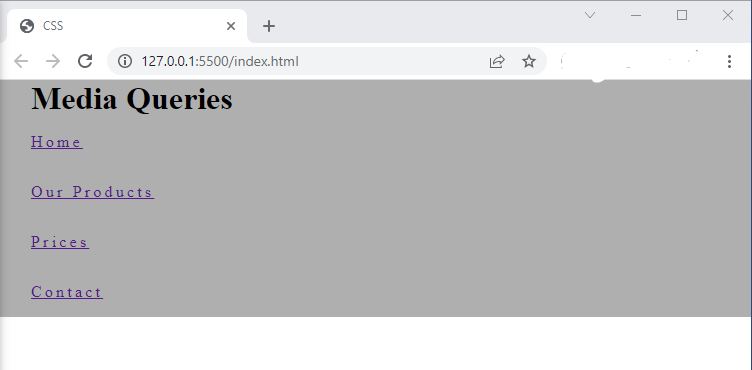
- In the browser, you should see the following if your screen size is less than 768 pixels:
- If your screen size is 768 pixels or larger, you should see the following instead:


Code Walkthrough and Explanation
Media Queries
Media queries in CSS are a technique that allows web designers to apply different styles to a webpage based on certain characteristics of the device or screen it is being viewed on. This is done by specifying conditions that must be met for certain CSS styles to be applied.
Media queries use the @media rule to define the conditions under which certain styles should be
applied.
These conditions can be based on various factors such as screen size, resolution, orientation, and even the type
of
device being used.
@media screen and (min-width: 768px)
@media screen and (min-width: 768px) is a media query in CSS that targets screens with a minimum
width
of 768 pixels.
This media query is used to specify a set of CSS rules that should be applied when the viewport width of the device is at least 768 pixels. The screen keyword indicates that the styles should apply to devices with a screen (as opposed to, for example, a print stylesheet).
In the exercise, different styles are applied to the navigation bar when the screen is 768 pixels or larger.
min-width
min-width is a CSS property that sets the minimum width of an element. It specifies the minimum
width
that the content of the element should have before any horizontal scrolling is applied.
For example, if you have a container element with a min-width of 500px and the content inside it
is only
300px wide, the container will still be displayed at 500px wide. However, if the content inside the container is
wider
than 500px, the container will expand to accommodate the content.
max-width
max-width is a CSS property that sets the maximum width of an element. It specifies the maximum
width
that the content of the element should have before it is truncated or wrapped.
For example, if you have a container element with a max-width of 500px and the content inside it
is only
300px wide, the container will be displayed at 300px wide. However, if the content inside the container is wider
than
500px, the container will be limited to a maximum width of 500px.
Experiment with the Code
- Try overriding the
letter-spacingof the links when the screen is greater than 768 pixels. - Try changing the
min-widthvalue of the media query and resizing your browser. - Try changing the
max-widthvalue and resizing your browser.
Video and Code References
Questions? Subscribe and ask in the video comments: