CSS Grid - Justify Content
Exercise
- In the "index.html" file, replace the code with the following:
<!DOCTYPE html>
<html lang="en">

<head>
  <meta charset="UTF-8">
  <meta http-equiv="X-UA-Compatible" content="IE=edge">
  <meta name="viewport" content="width=device-width, initial-scale=1.0">
  <title>CSS</title>
  <link rel="stylesheet" href="./css/styles.css">
</head>

<body>
  <h1>CSS Grid</h1>
  <h3>Justify Content</h3>
  <!-- grid container -->
  <div class="grid-container-3-columns-by-3-rows">
    <!-- flex items -->
    <div class="box box1">
      <p>Grid Item 1</p>
    </div>
    <div class="box box2">
      <p>Grid Item 2</p>
    </div>
    <div class="box box3">
      <p>Grid Item 3</p>
    </div>
    <div class="box box4">
      <p>Grid Item 4</p>
    </div>
    <div class="box box5">
      <p>Grid Item 5</p>
    </div>
    <div class="box box6">
      <p>Grid Item 6</p>
    </div>
  </div>
  <!-- grid container -->
  <div class="grid-container-3-columns-by-3-rows justify-content">
    <!-- flex items -->
    <div class="box box1">
      <p>Grid Item 1</p>
    </div>
    <div class="box box2">
      <p>Grid Item 2</p>
    </div>
    <div class="box box3">
      <p>Grid Item 3</p>
    </div>
    <div class="box box4">
      <p>Grid Item 4</p>
    </div>
    <div class="box box5">
      <p>Grid Item 5</p>
    </div>
    <div class="box box6">
      <p>Grid Item 6</p>
    </div>
  </div>
</body>

</html>
- Save.
- If "Live Server" is not already running, right-click anywhere in the editor and select "Open with Live Server" from the context menu.
- In the "styles.css" file, replace the code with the following:
/* Reset Browser Defaults */
* {
  margin: 0;
  padding: 0;
  box-sizing: border-box;
}

.grid-container-3-columns-by-3-rows {
  border: 5px solid blue;
  margin: 10px;
  display: grid;
  grid-template-columns: repeat(3, 150px);
}

.justify-content {
  justify-content: center;
}

.box {
  padding: 1rem;
  border: 2px solid red;
}

.box1 {
  background: green;
}

.box2 {
  background: yellow;
}

.box3 {
  background: orange;
}

.box4 {
  background: brown;
}

.box5 {
  background: grey;
}

.box6 {
  background: violet;
}
- Save.
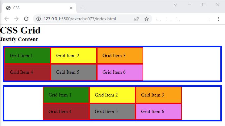
- In the browser, you should see the following:

Code Walkthrough and Explanation
justify-content
In CSS Grid, the justify-content property is used to align grid items along the main axis
(horizontal
axis) of a grid container.
start: aligns grid items to the start of the grid containerend: aligns grid items to the end of the grid containercenter: aligns grid items to the center of the grid containerstretch: stretches grid items to fill the entire grid containerspace-between: distributes grid items evenly along the main axis with the first item at the start of the axis and the last item at the end of the axisspace-around: distributes grid items evenly along the main axis with equal space around themspace-evenly: distributes grid items evenly along the main axis with equal space between them
The default value of justify-content is flex-start. The
grid-template-columns
must be set with absolute value units like px in order for justify-content to take
effect.
Experiment with the Code
- Try changing the value in the
justify-contentproperty and see what happens.
Video and Code References
Questions? Subscribe and ask in the video comments: