CSS Flexbox - Justify Content
Exercise
- In the "index.html" file, replace the code with the following:
<!DOCTYPE html>
<html lang="en">

<head>
  <meta charset="UTF-8">
  <meta http-equiv="X-UA-Compatible" content="IE=edge">
  <meta name="viewport" content="width=device-width, initial-scale=1.0">
  <title>CSS</title>
  <link rel="stylesheet" href="./css/styles.css">
</head>

<body>
  <h1>CSS Flexbox</h1>
  <h3>Justify Content</h3>
  <!-- flex container -->
  <div class="flex-container">
    <!-- flex items -->
    <div class="box flex-item-1">
      <p>Flex Item 1</p>
    </div>
    <div class="box flex-item-2">
      <p>Flex Item 2</p>
    </div>
    <div class="box flex-item-3">
      <p>Flex Item 3</p>
    </div>
  </div>
  <!-- flex container -->
  <div class="flex-container flex-start">
    <!-- flex items -->
    <div class="box flex-item-1">
      <p>Flex Item 1</p>
    </div>
    <div class="box flex-item-2">
      <p>Flex Item 2</p>
    </div>
    <div class="box flex-item-3">
      <p>Flex Item 3</p>
    </div>
  </div>
  <!-- flex container -->
  <div class="flex-container flex-end">
    <!-- flex items -->
    <div class="box flex-item-1">
      <p>Flex Item 1</p>
    </div>
    <div class="box flex-item-2">
      <p>Flex Item 2</p>
    </div>
    <div class="box flex-item-3">
      <p>Flex Item 3</p>
    </div>
  </div>
  <!-- flex container -->
  <div class="flex-container space-between">
    <!-- flex items -->
    <div class="box flex-item-1">
      <p>Flex Item 1</p>
    </div>
    <div class="box flex-item-2">
      <p>Flex Item 2</p>
    </div>
    <div class="box flex-item-3">
      <p>Flex Item 3</p>
    </div>
  </div>
  <!-- flex container -->
  <div class="flex-container space-around">
    <!-- flex items -->
    <div class="box flex-item-1">
      <p>Flex Item 1</p>
    </div>
    <div class="box flex-item-2">
      <p>Flex Item 2</p>
    </div>
    <div class="box flex-item-3">
      <p>Flex Item 3</p>
    </div>
  </div>
</body>

</html>
- Save.
- If "Live Server" is not already running, right-click anywhere in the editor and select "Open with Live Server" from the context menu.
- In the "styles.css" file, replace the code with the following:
.flex-container {
  border: 5px solid blue;
  display: flex;
  margin: 10px;
  width: 600px;
}

.flex-start {
  justify-content: flex-start;
}

.flex-end {
  justify-content: flex-end;
}

.space-between {
  justify-content: space-between;
}

.space-around {
  justify-content: space-around;
}

.box {
  padding: 10px;
  text-align: center;
  font-size: 20px;
}

.flex-item-1 {
  background: red;
}

.flex-item-2 {
  background: green;
}

.flex-item-3 {
  background: yellow;
}
- Save.
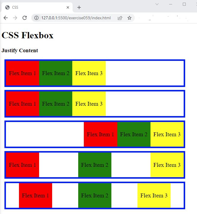
- In the browser, you should see the following:

Code Walkthrough and Explanation
justify-content
justify-content is a CSS property that defines how the flex items are distributed along the main
axis of
the container. It specifies the alignment of items within the flex container in a row or a column.
The possible values for justify-content are:
flex-start: Items are packed towards the start of the flex container.flex-end: Items are packed towards the end of the flex container.center: Items are centered along the main axis of the flex container.space-between: Items are evenly distributed in the flex container, with the first item aligning to the start of the container and the last item aligning to the end of the container.space-around: Items are evenly distributed in the flex container, with equal space around them.space-evenly: Items are evenly distributed in the flex container, with equal space between them.
These values can be applied to both horizontal and vertical flex containers.
Experiment with the Code
- Try adding your own boxes and using different values for
justify-content.
Video and Code References
Questions? Subscribe and ask in the video comments: