CSS Flexbox - Align Content
Exercise
- In the "index.html" file, replace the code with the following:
<!DOCTYPE html>
<html lang="en">

<head>
  <meta charset="UTF-8">
  <meta http-equiv="X-UA-Compatible" content="IE=edge">
  <meta name="viewport" content="width=device-width, initial-scale=1.0">
  <title>CSS</title>
  <link rel="stylesheet" href="./css/styles.css">
</head>

<body>
  <h1>CSS Flexbox</h1>
  <h3>Align Content</h3>
  <!-- flex container -->
  <div class="flex-container flex-start">
    <!-- flex items -->
    <div class="box flex-item-1">
      <p>Flex Item 1</p>
    </div>
    <div class="box flex-item-2">
      <p>Flex Item 2</p>
    </div>
    <div class="box flex-item-3">
      <p>Flex Item 3</p>
    </div>
    <div class="box flex-item-4">
      <p>Flex Item 4</p>
    </div>
    <div class="box flex-item-5">
      <p>Flex Item 5</p>
    </div>
    <div class="box flex-item-6">
      <p>Flex Item 6</p>
    </div>
  </div>
  <!-- flex container -->
  <div class="flex-container flex-end">
    <!-- flex items -->
    <div class="box flex-item-1">
      <p>Flex Item 1</p>
    </div>
    <div class="box flex-item-2">
      <p>Flex Item 2</p>
    </div>
    <div class="box flex-item-3">
      <p>Flex Item 3</p>
    </div>
    <div class="box flex-item-4">
      <p>Flex Item 4</p>
    </div>
    <div class="box flex-item-5">
      <p>Flex Item 5</p>
    </div>
    <div class="box flex-item-6">
      <p>Flex Item 6</p>
    </div>
  </div>
</body>

</html>
- Save.
- If "Live Server" is not already running, right-click anywhere in the editor and select "Open with Live Server" from the context menu.
- In the "styles.css" file, replace the code with the following:
.flex-container {
  border: 5px solid blue;
  display: flex;
  margin: 10px;
  height: 350px;
  flex-wrap: wrap;
}

.flex-start {
  align-content: flex-start;
}

.flex-end {
  align-content: flex-end;
}

.box {
  padding: 10px;
  width: 100px;
  height: 100px;
  text-align: center;
  font-size: 20px;
}

.flex-item-1 {
  background: red;
}

.flex-item-2 {
  background: green;
}

.flex-item-3 {
  background: yellow;
}

.flex-item-4 {
  background: purple;
}

.flex-item-5 {
  background: orange;
}

.flex-item-6 {
  background: blueviolet;
}
- Save.
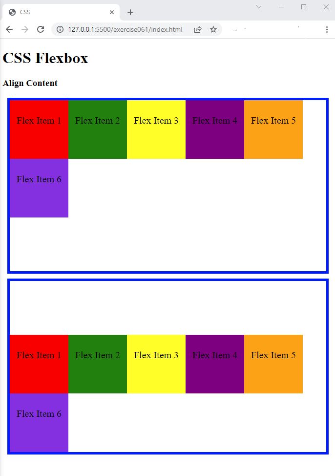
- In the browser, you should see the following:

Code Walkthrough and Explanation
align-content
The align-content property in CSS is used to align multiple rows or columns of flex items within a flex
container. It
specifies the distribution of space between and around content items along the cross-axis of the flex container.
It
applies only to multi-line flex containers, where flex-wrap is set to wrap,
wrap-reverse, or inherit.
It has several possible values that specify how to align the rows or columns of flex items:
stretch(default): This value stretches the rows or columns to fill the container along the cross-axis.center: This value centers the rows or columns within the container along the cross-axis.flex-start: This value aligns the rows or columns to the start of the container along the cross-axis.flex-end: This value aligns the rows or columns to the end of the container along the cross-axis.space-between: This value evenly distributes the rows or columns along the cross-axis, leaving no extra space at the start or end.space-around: This value evenly distributes the rows or columns along the cross-axis, leaving equal amounts of extra space at the start and end.space-evenly: This value evenly distributes the rows or columns along the cross-axis, leaving equal amounts of space between each item and at the start and end.
The align-content property does not affect the alignment of individual items within each row or
column.
To do that, you can use the align-items property instead. In general, the
align-content
property is useful for controlling the spacing and alignment of multiple rows or columns of items within a flex
container.
Experiment with the Code
- Try adding your own boxes and using different values for
align-content.
Video and Code References
Questions? Subscribe and ask in the video comments: